Updated
Icon Tile
Icon Tile puts one icon on a rounded tile, as the visual anchor of a paywall, a feature gate, an empty state or a Live Card.
Updated
Preview
Five colors in two styles and two sizes, each bound to its state tokens.
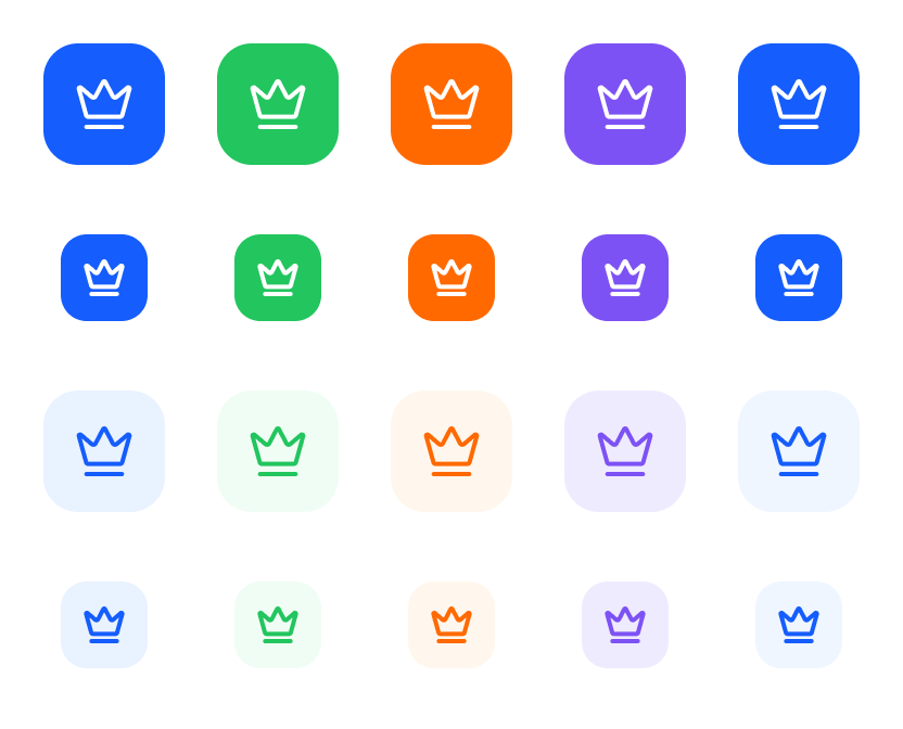
Source: Icon Tile on the Avatar page of the Appetite UI Figma file, read on November 18, 2026.
Figma and code
Icon Tile is in the Appetite UI Figma library. Appetite UI Code does not have it yet.
Build it from the tokens: every stack of Appetite UI Code ships them with the names and values of the Figma file. Add your stack's package first: Install the code.
When is an Icon Tile Solid and when is it Tint?
Solid is the filled accent and stays legible on any surface in Light and Dark. Tint is the quiet version for lists and secondary cards.
Use one Solid tile as the anchor of a screen, such as the crown on a paywall, and Tint where several tiles sit together. Color picks the accent: Brand, Success, Warning, Feature or Information.
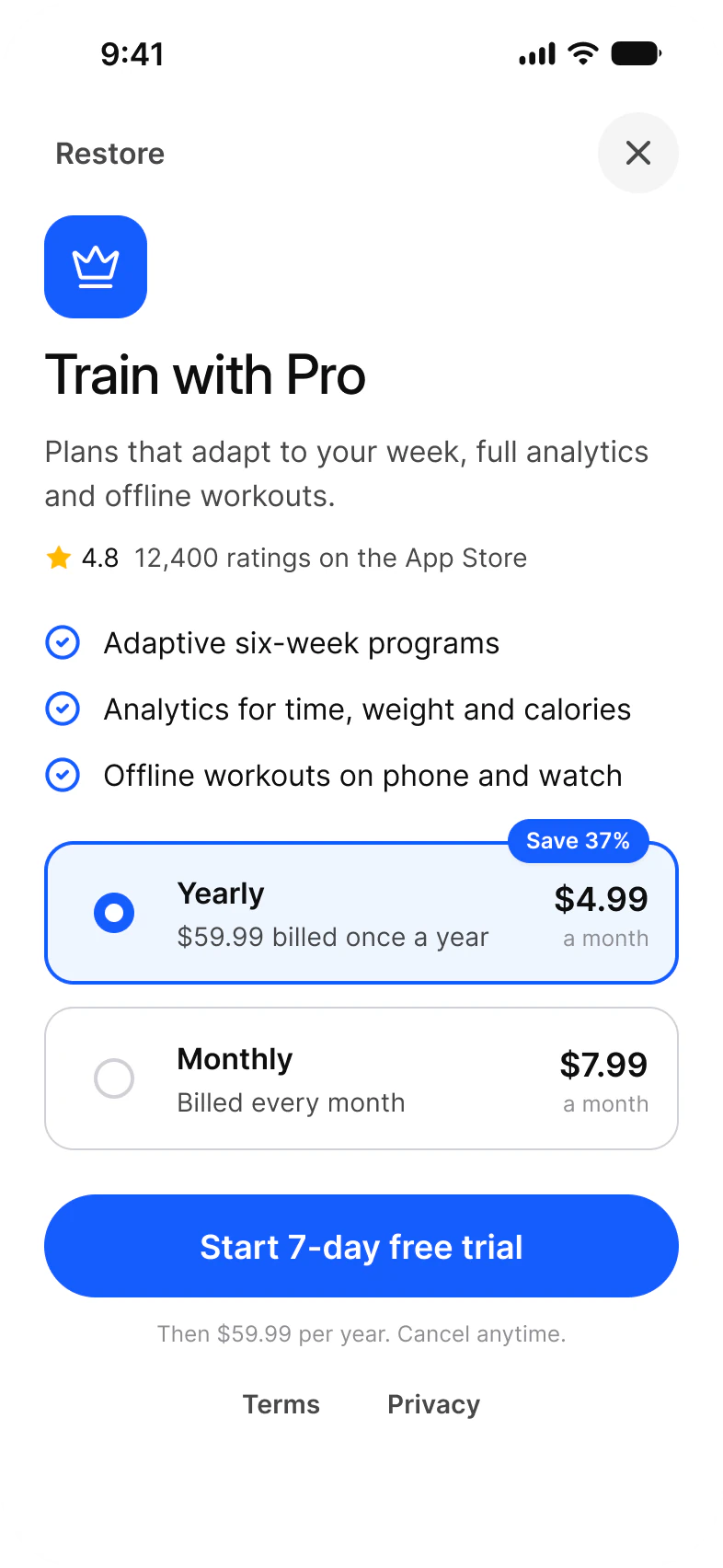
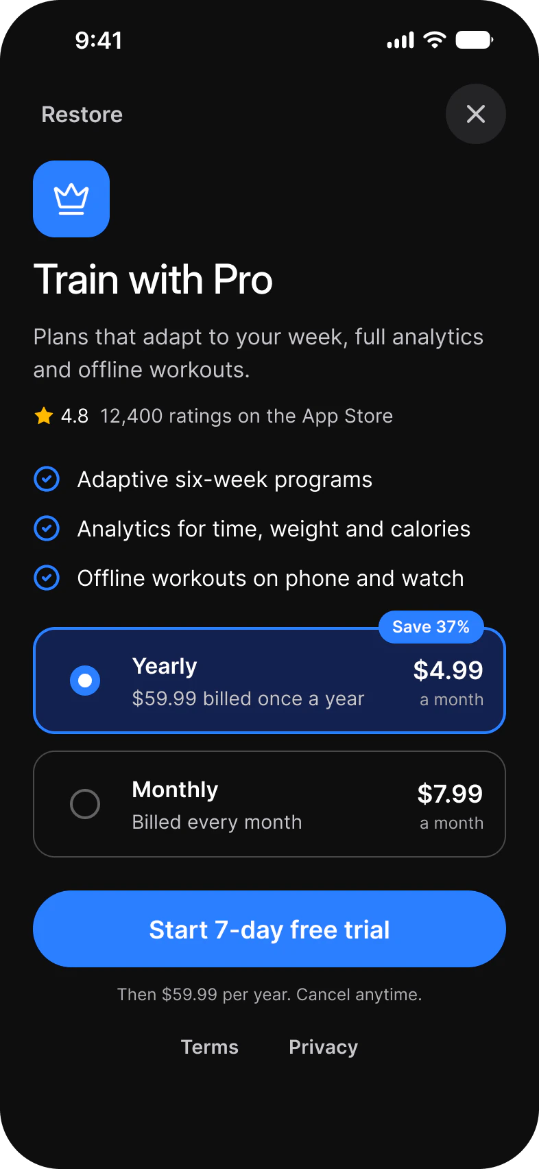
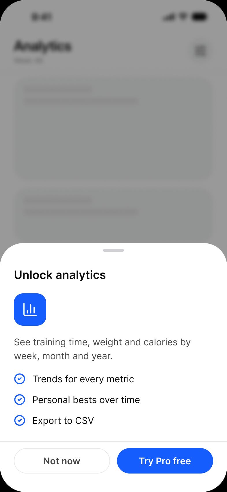
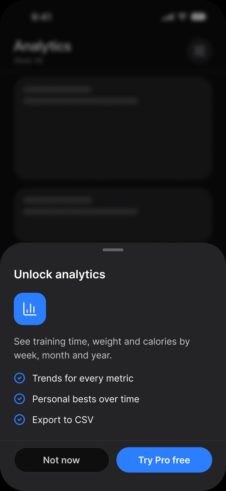
For a person rather than a thing, use Avatar. The tile also leads every Live Card.
Properties
Three variant axes and the icon.
| Property | Type | Default |
|---|---|---|
Style | Tint, Solid | Solid |
Size | lg, md | lg |
Color | Brand, Success, Warning, Feature, Information | Brand |
Icon | Instance swap, any Lucide icon | crown |
| Set | Variants | Size |
|---|---|---|
Icon Tile | Style crossed with Size and Color, 20 in all | lg 56, md 40 |
Dimensions
The icon is half the tile.
| Size | Tile | Icon |
|---|---|---|
lg | 56 | 28 |
md | 40 | 20 |
The icons come from the kit's Icons.
Is there a native Icon Tile on iOS or Android?
No. Icon Tile has no counterpart on either platform.
| Platform | Counterpart | What to build |
|---|---|---|
| iOS | None. | An SF Symbol or the Lucide icon on a rounded rectangle filled from the state tokens. |
| Android | None. | A Material icon or the Lucide icon in a rounded box filled from the state tokens. |
The tile is decorative next to a title that names the same thing, so it needs no accessible label of its own. The kit has no prototype interaction on Icon Tile.
See Icon Tile in the kit.
The read-only Figma preview opens the Appetite UI file on Icon Tile, so you can check it before you buy.
The file holds 592 variables in 6 collections and exports its token values to SwiftUI, Jetpack Compose, Flutter and CSS. Solo covers one person and Team up to ten people. You pay once and keep lifetime updates.