Updated
M3 Progress indicator
Progress indicator shows how much of a known amount of work is done, as a bar or a circle. It is part of the Material 3 mirror.
Updated
Preview
Linear and Circular, Flat and Wave, all at 60 percent.
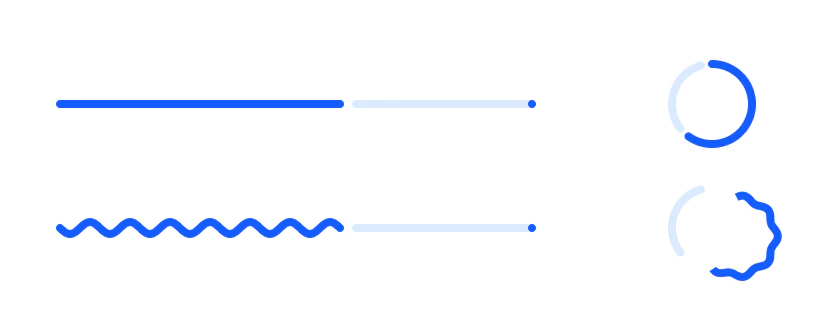
Source: M3 / Progress indicator on the Material 3 Progress page of the Appetite UI Figma file, read on November 18, 2026.
Which Progress indicator type and style should you use?
Linear for a bar across the content, Circular for a compact spot. Wave adds the expressive wave to the active part for longer waits; Flat stays calm.
The track starts 4 after the active part, and Linear ends in a stop dot. For a wait with no known end, use the Loading indicator. The kit's own bars and spinners are on Progress.
Properties
Two variant axes.
| Property | Type | Default |
|---|---|---|
Type | Linear, Circular | Linear |
Style | Flat, Wave | Flat |
| Set | Variants | Size |
|---|---|---|
M3 / Progress indicator | 4, Type crossed with Style | Linear 240 x 12, Circular 48 x 48 |
Dimensions
In dp.
| Part | Value |
|---|---|
| Linear | 240 x 12 as drawn, stretched to the content |
| Circular | 48 |
| Gap before the track | 4 |
| Value shown | 60 percent |
What does Progress indicator map to in Compose and on iOS?
Four Compose functions, one per variant. On iOS, a ProgressView with a value.
| Platform | Counterpart |
|---|---|
| Android, Compose | LinearProgressIndicator, LinearWavyProgressIndicator, CircularProgressIndicator, CircularWavyProgressIndicator |
| iOS, SwiftUI | ProgressView(value:), linear or circular style |
The kit has no prototype interaction on Progress indicator.
See M3 Progress indicator in the kit.
The read-only Figma preview opens the Appetite UI file on M3 Progress indicator, so you can check it before you buy.
The file holds 592 variables in 6 collections and exports its token values to SwiftUI, Jetpack Compose, Flutter and CSS. Solo covers one person and Team up to ten people. You pay once and keep lifetime updates.