Updated
M3 Toolbar
Toolbar is a row of actions for the current screen, floating over content or docked to the bottom. It is part of the Material 3 mirror.
Updated
Preview
Floating horizontal, floating vertical and docked, each in Vibrant and Standard.
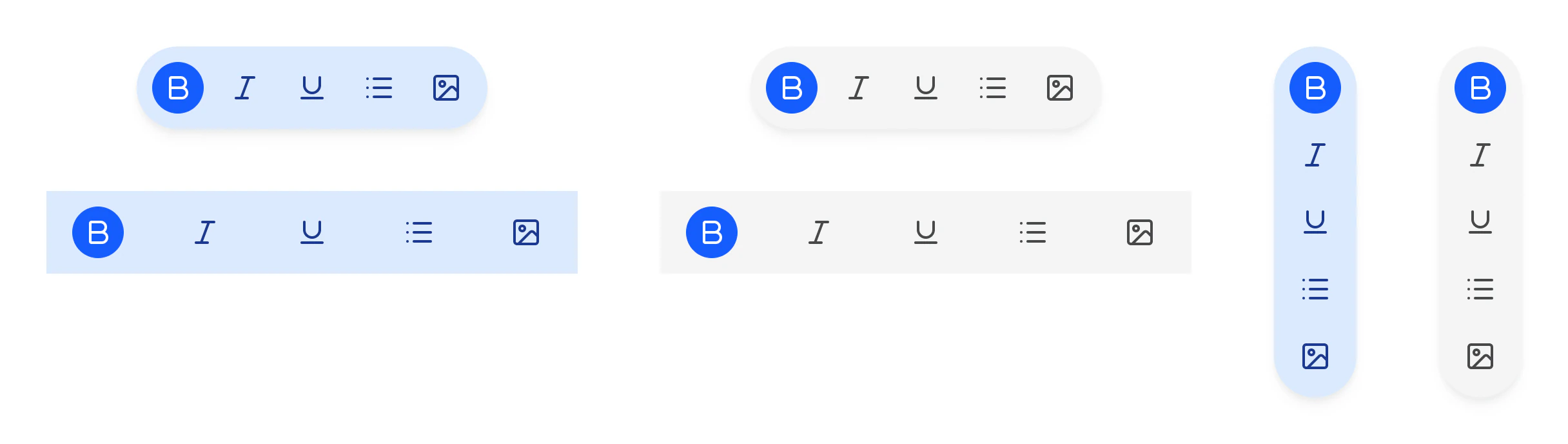
Source: M3 / Toolbar on the Material 3 Toolbar page of the Appetite UI Figma file, read on November 18, 2026.
When is a Toolbar Floating and when is it Docked?
Floating is a 64 fully round bar over content, horizontal at the bottom or vertical along an edge. Docked spans the bottom edge at 64 and replaces the bottom app bar.
Color=Vibrant sits on Primary Container for a prominent bar, Standard on Surface Container. Swap the icon in each Action; the first one shows a selected toggle.
The kit's own toolbar, built on its tokens rather than Material's, is Toolbar.
Properties
Three variant axes. Orientation applies to the Floating type.
| Property | Type | Default |
|---|---|---|
Type | Floating, Docked | Floating |
Orientation | Horizontal, Vertical | Horizontal |
Color | Vibrant, Standard | Vibrant |
| Set | Variants | Size |
|---|---|---|
M3 / Toolbar | 6, Floating in both orientations and Docked, each in two colors | Floating 272 x 64 or 64 x 272, Docked 412 x 64 |
Dimensions
In dp.
| Part | Value |
|---|---|
| Floating bar | 64 thick, fully round |
| Docked bar | 64 tall, full width |
| Docked width as drawn | 412, the Material phone width |
What does Toolbar map to in Compose and on iOS?
HorizontalFloatingToolbar, VerticalFloatingToolbar and FlexibleBottomAppBar in Jetpack Compose. On iOS, a bottom toolbar.
| Platform | Counterpart |
|---|---|
| Android, Compose | HorizontalFloatingToolbar, VerticalFloatingToolbar, FlexibleBottomAppBar |
| iOS, SwiftUI | .toolbar with items in the bottom bar |
The kit has no prototype interaction on the Material Toolbar.
See M3 Toolbar in the kit.
The read-only Figma preview opens the Appetite UI file on M3 Toolbar, so you can check it before you buy.
The file holds 592 variables in 6 collections and exports its token values to SwiftUI, Jetpack Compose, Flutter and CSS. Solo covers one person and Team up to ten people. You pay once and keep lifetime updates.