Updated
M3 Button group
Button group is a row of related buttons that reads as one control. It is part of the Material 3 mirror and maps to ButtonGroup in Compose.
Updated
Preview
Two types in two sizes. Standard spaces tonal buttons apart; Connected joins segments into one control.
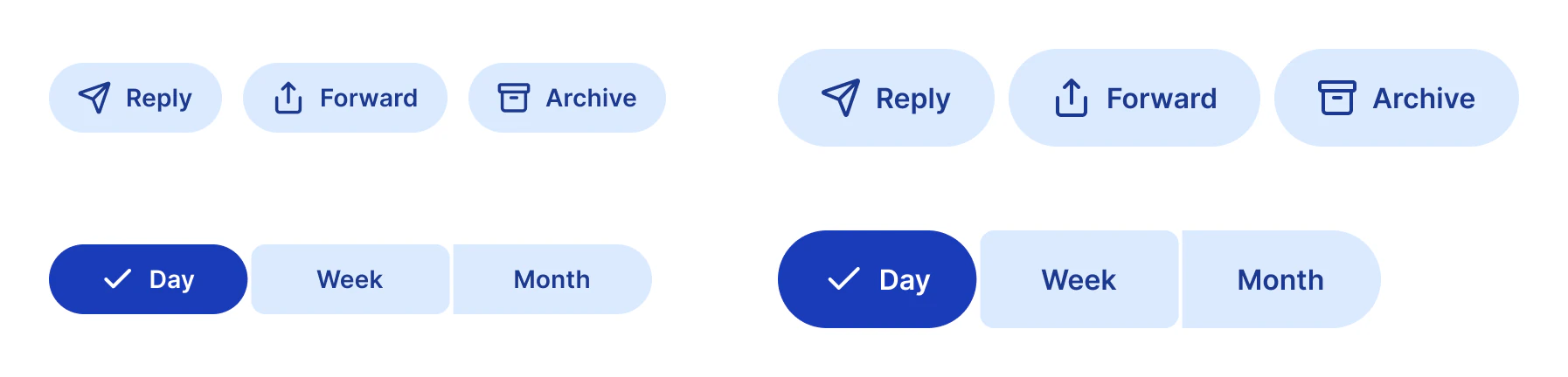
Source: M3 / Button group on the Material 3 Button page of the Appetite UI Figma file, read on November 18, 2026.
When is a Button group Standard and when is it Connected?
Standard for actions on the same object. Connected for one choice between views, in place of the older segmented button.
| Type | Use it for | How it looks |
|---|---|---|
Standard | Actions on the same object: Reply, Forward, Archive | Tonal buttons, 12 apart at Small and 8 at Medium |
Connected | One choice between views: Day, Week, Month | Segments 2 apart with 8 inner corners and fully round outer corners; the selected segment turns Secondary and fully round |
Rename the segments with Segment 1 to 3. The single buttons are on the Material 3 page, and the kit's own choice control is Segmented Control.
Properties
Two variant axes and three segment labels.
| Property | Type | Default |
|---|---|---|
Type | Standard, Connected | Standard |
Size | Small, Medium | Small |
Segment 1 | Text | Day |
Segment 2 | Text | Week |
Segment 3 | Text | Month |
| Set | Variants | Size |
|---|---|---|
M3 / Button group | 4, Type crossed with Size | Standard 353 x 48 and 424 x 56; Connected 345 x 40 and 345 x 56 |
Dimensions
The gaps and corners that tell the two types apart, in dp.
| Part | Value |
|---|---|
| Standard gap, Small | 12 |
| Standard gap, Medium | 8 |
| Connected gap | 2 |
| Connected inner corners | 8 |
| Connected outer corners | Fully round |
What does Button group map to in Compose and on iOS?
ButtonGroup in Jetpack Compose. On iOS the closest control for the Connected type is a segmented picker.
| Platform | Counterpart |
|---|---|
| Android, Compose | ButtonGroup |
| iOS, SwiftUI | Picker with .segmented style for a Connected choice; separate buttons for Standard |
The prototype shows the hover state on each segment in 200 ms.
See M3 Button group in the kit.
The read-only Figma preview opens the Appetite UI file on M3 Button group, so you can check it before you buy.
The file holds 592 variables in 6 collections and exports its token values to SwiftUI, Jetpack Compose, Flutter and CSS. Solo covers one person and Team up to ten people. You pay once and keep lifetime updates.