Updated
Plan Card
Plan Card is one selectable plan on a paywall. Stack two to four of them and select exactly one.
Updated
On this page
Preview
Two states at one height. The selected card carries a 2 brand stroke and a brand tint.

Source: Plan Card on the Card page of the Appetite UI Figma file, read on November 18, 2026.
Figma and code
Plan Card is in the Appetite UI Figma library. Appetite UI Code does not have it yet.
Build it from the tokens: every stack of Appetite UI Code ships them with the names and values of the Figma file. Add your stack's package first: Install the code.
How many Plan Cards go on a paywall?
Two to four, stacked with a 16 gap, and exactly one selected.
Put the saving or the trial in Badge, and the billing rule in Detail, so the price on the right can stay the per month figure people compare. Selection never changes the height of a card, so the stack does not move when someone changes their mind.
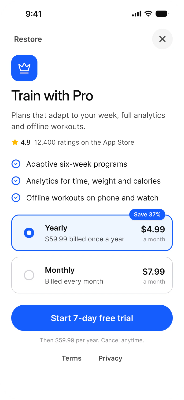
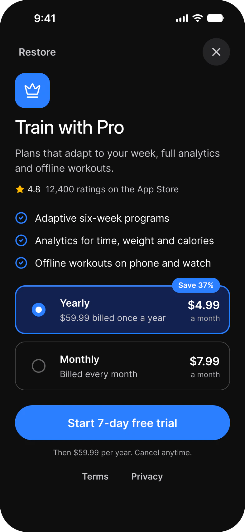
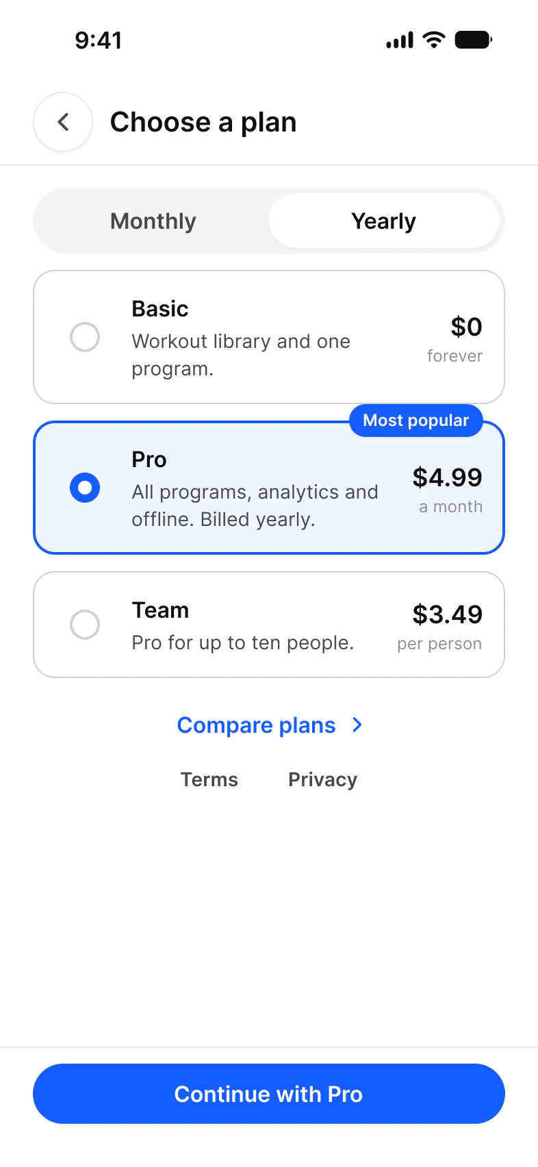
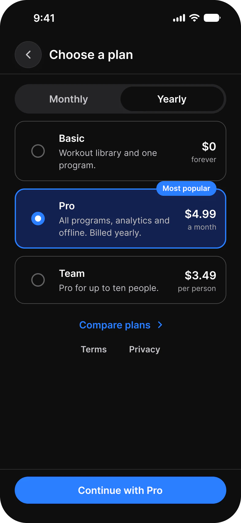
More paywall layouts are on the Paywall screens page. For a card that is not a choice, use Card.
Properties
One variant axis and the texts of a plan.
| Property | Type | Default |
|---|---|---|
Selected | False, True | False |
Name | Text | Yearly |
Detail | Text | $59.99 billed once a year |
Price | Text | $4.99 |
Period | Text | per month |
Badge | Boolean | true |
Show Price | Boolean | true |
| Set | Variants | Size |
|---|---|---|
Plan Card | 2, Selected False and True | 345 x 78 |
The radio inside is display only. The whole card is the target.
Dimensions
Both states are the same size, so selection never moves the stack.
| Part | Value |
|---|---|
| Card | 345 x 78 |
| Selected stroke | 2, brand |
| Gap between cards | 16 |
What do iOS and Android use instead of Plan Card?
iOS can draw its own plan list with SubscriptionStoreView. Android has no Material component for it, and Google Play shows its own purchase sheet after the choice.
| Platform | Counterpart | When to use Plan Card |
|---|---|---|
| iOS | StoreKit SubscriptionStoreView draws its own plan list. | When you build the paywall yourself. |
| Android | None in Material 3. Google Play shows its purchase sheet after the choice. | For the choice before that sheet opens. |
Prototype
Tap an unselected card to select it in 120 ms.
Select one card at a time in code too: selecting a card clears the others.
See Plan Card in the kit.
The read-only Figma preview opens the Appetite UI file on Plan Card, so you can check it before you buy.
The file holds 592 variables in 6 collections and exports its token values to SwiftUI, Jetpack Compose, Flutter and CSS. Solo covers one person and Team up to ten people. You pay once and keep lifetime updates.