Updated
M3 Split button
Split button joins a primary action to a menu of related actions, such as Edit with Duplicate and Move. It is part of the Material 3 mirror.
Updated
Preview
Three colors, two sizes, closed and open. Open rounds the trailing half and flips the chevron.
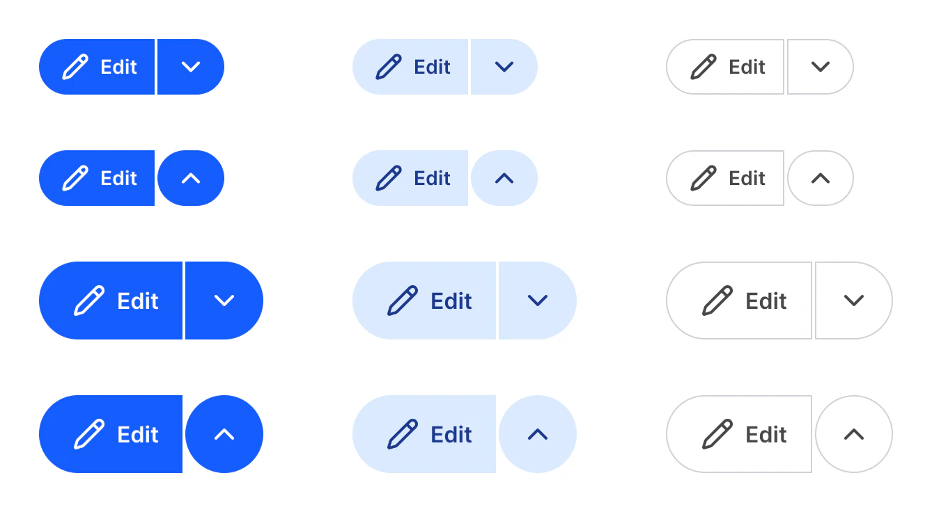
Source: M3 / Split button on the Material 3 Button page of the Appetite UI Figma file, read on November 18, 2026.
When do you use a Split button?
When one action is the usual choice and a few related ones sit behind it. Filled for the main action of a screen, Tonal for a secondary one, Outlined for a quiet one.
The leading half runs the action, the trailing half opens the menu. Set Open=True while the menu shows. For a single action, use a plain button from the Material 3 page; for a menu without a main action, see Context Menu.
Properties
Three variant axes, the label and the icon.
| Property | Type | Default |
|---|---|---|
Size | Small, Medium | Small |
Color | Filled, Tonal, Outlined | Filled |
Open | False, True | False |
Label | Text | Edit |
Icon | Instance swap | pencil |
Show icon | Boolean | true |
| Set | Variants | Size |
|---|---|---|
M3 / Split button | 12, Size crossed with Color and Open | Small 133 x 40, Medium 161 x 56; Outlined 2 wider |
Dimensions
In dp.
| Part | Value |
|---|---|
| Height, Small | 40 |
| Height, Medium | 56 |
| Gap between the halves | 2 |
| Inner corners | 4, fully round on the trailing half when open |
What does Split button map to in Compose and on iOS?
SplitButtonLayout in Jetpack Compose. On iOS the same idea is a menu with a primary action.
| Platform | Counterpart |
|---|---|
| Android, Compose | SplitButtonLayout |
| iOS, SwiftUI | Menu with primaryAction, a tap runs the action and a long press opens the menu |
The kit has no prototype interaction on Split button.
See M3 Split button in the kit.
The read-only Figma preview opens the Appetite UI file on M3 Split button, so you can check it before you buy.
The file holds 592 variables in 6 collections and exports its token values to SwiftUI, Jetpack Compose, Flutter and CSS. Solo covers one person and Team up to ten people. You pay once and keep lifetime updates.