Updated
Live Card
Live Card shows one value that changes within minutes, like a timer, a delivery or a flight, on home and detail screens.
Updated
On this page
Preview
A label, one large value with its unit, a line of context, and a visual that changes with the value.
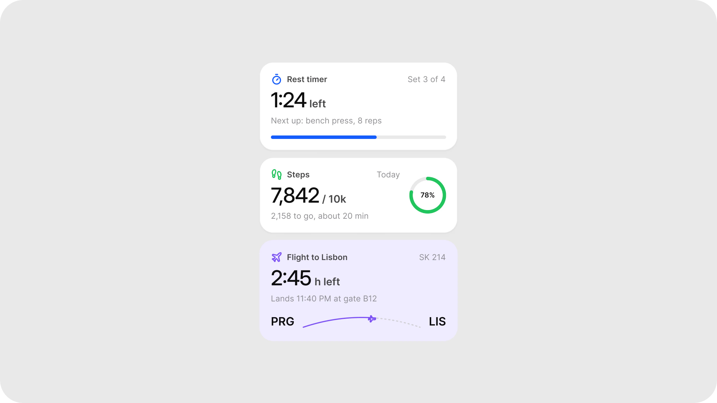
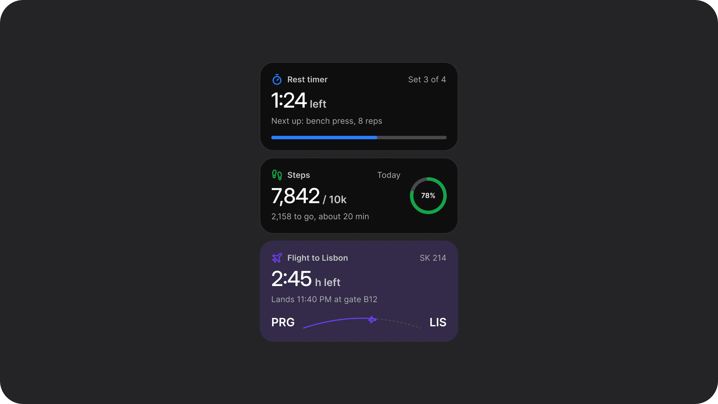
Source: Live Card on the Live Card page of the Appetite UI Figma file, read on November 18, 2026.
Figma and code
Live Card is in the Appetite UI Figma library. Appetite UI Code does not have it yet.
Build it from the tokens: every stack of Appetite UI Code ships them with the names and values of the Figma file. Add your stack's package first: Install the code.
Which Live Card type fits which value?
Five types share the same head and differ in the visual under the value.
| Type | Visual | Use it for |
|---|---|---|
Live Card / Progress | A progress bar | Timers, uploads and downloads |
Live Card / Steps | Three stages: done, current and next | Deliveries, laundry cycles, setup tasks |
Live Card / Route | An arc between two places with a marker at the current position | Flights, rides and deliveries without a map on screen |
Live Card / Ring | A ring with the share of a goal | Steps, water, savings: a number that needs its target next to it |
Live Card / Bars | A 7 day bar chart with one highlighted day | Weekly activity, spending or screen time |
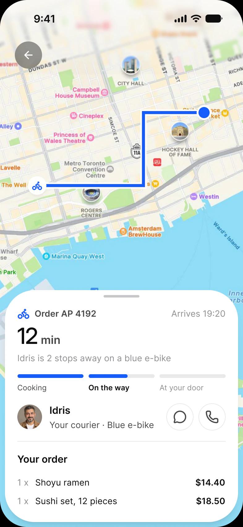
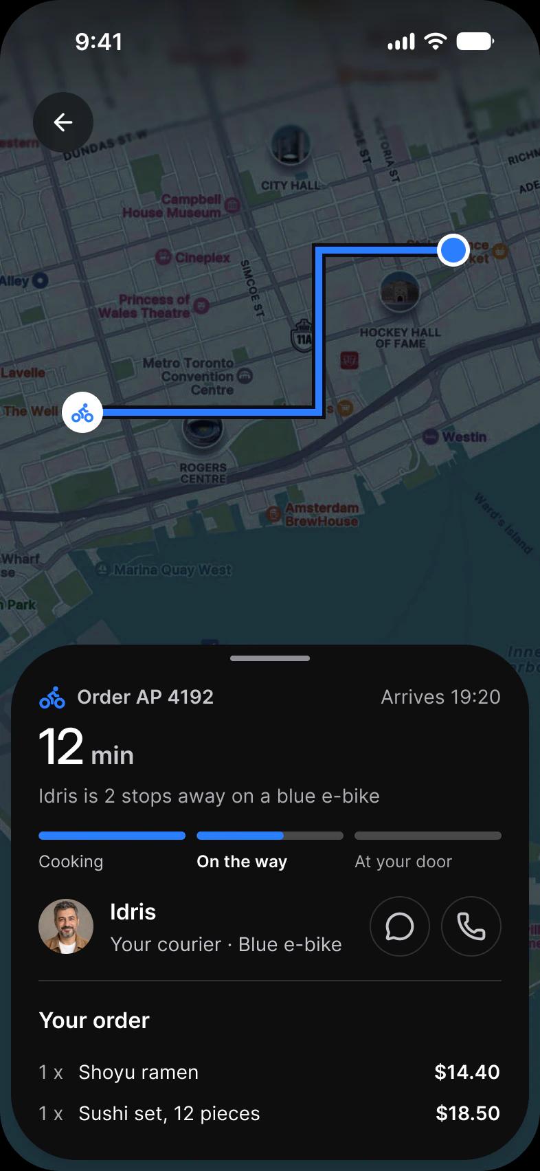
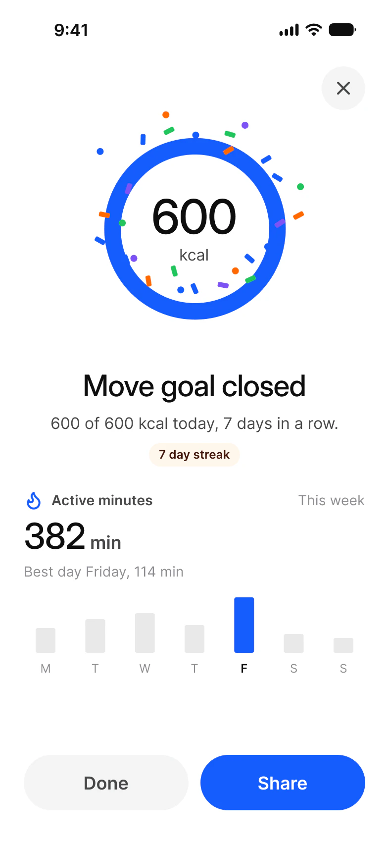
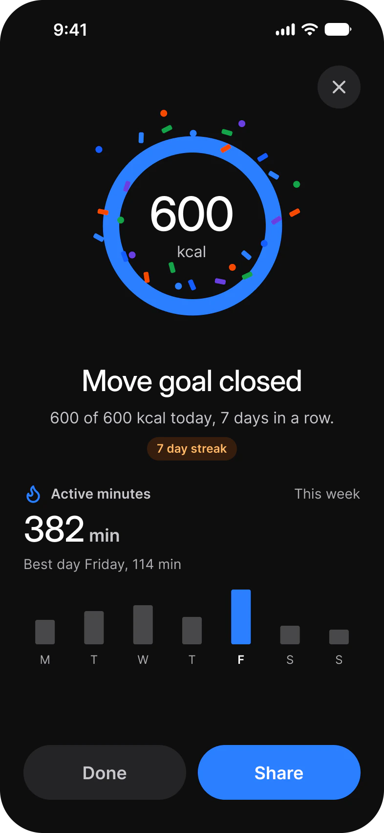
For a chart people read rather than glance at, use Chart.
When is a Live Card Surface, Tint or Plain?
Surface on a screen background, Tint to accent one card, Plain inside sheets and lists that already have a surface.
Color switches the accent: Brand, Success, Warning or Feature. Plain is 40 shorter than Surface and Tint in every type. Swap the icon at the top left with the Icon property.
| Type | Surface and Tint | Plain |
|---|---|---|
Progress | 345 x 154 | 345 x 114 |
Steps | 345 x 178 | 345 x 138 |
Route | 345 x 176 | 345 x 136 |
Ring | 345 x 132 | 345 x 92 |
Bars | 345 x 228 | 345 x 188 |
Properties
Every type shares two variant axes and six content properties, and adds the texts of its own visual.
| Property | Type | Default on Progress |
|---|---|---|
Color | Brand, Success, Warning, Feature | Brand |
Style | Surface, Tint, Plain | Surface |
Icon | Instance swap | timer |
Label | Text | Rest timer |
Trailing | Text | Set 3 of 4 |
Show trailing | Boolean | true |
Value | Text | 1:24 |
Unit | Text | left |
Context | Text | Next up: bench press, 8 reps |
| Type | Own properties |
|---|---|
Progress | None |
Steps | Step 1, Step 2, Step 3: the stage names |
Route | From, To: the place codes |
Ring | Percent: the share the ring shows |
Bars | None |
| Set | Variants |
|---|---|
| Each of the five types | 12, Color crossed with Style |
How does a Live Card move?
The value rolls in with text/roll and the visual draws on the kit's motion tokens.
| Type | Value | Visual |
|---|---|---|
Progress | text/roll | The bar draws with path/draw |
Steps | text/roll | The current stage draws with path/draw |
Route | Not stated in the file | The arc draws with path/draw, the marker pops in with enter/pop |
Ring | text/roll | The ring draws with path/draw |
Bars | text/roll | The bars rise one by one, 30 ms apart |
The tokens are on Motion. The Figma file has no prototype interaction on Live Card; the motion is for the build.
How does Live Card differ from a Live Activity?
Live Card lives inside your app. For the Lock Screen and the Dynamic Island, use iOS / Live Activity.
| Platform | Counterpart | What differs |
|---|---|---|
| iOS | iOS / Live Activity on the Apple pages, ActivityKit in code | A Live Activity sits on the Lock Screen and in the Dynamic Island. Live Card sits on your home and detail screens. |
| Android | None in Material 3. | Live Card is a card in your own layout. |
The Apple counterpart is on the iOS page.
See Live Card in the kit.
The read-only Figma preview opens the Appetite UI file on Live Card, so you can check it before you buy.
The file holds 592 variables in 6 collections and exports its token values to SwiftUI, Jetpack Compose, Flutter and CSS. Solo covers one person and Team up to ten people. You pay once and keep lifetime updates.