Updated
Slide Button
Slide Button asks for a drag instead of a tap, for the one action on a screen that would cost something if it fired by accident.
Updated
On this page
Preview
A track with a thumb at its leading edge. The thumb slides along the track, and the track turns solid with a check when the action is done.

Type=Brand commits an action, such as finishing a workout or paying. Type=Error destroys something, such as deleting an account. Both share the same four states: Default, Sliding, Complete and Disabled.
Source: Slide Button on the Button page of the Appetite UI Figma file, read on November 18, 2026.
Figma and code
Slide Button is in the Appetite UI Figma library. Appetite UI Code does not have it yet.
Build it from the tokens: every stack of Appetite UI Code ships them with the names and values of the Figma file. Add your stack's package first: Install the code.
When should you use a Slide Button instead of a Button?
Only where an accidental tap would cost something: ending a workout, paying, deleting. Everywhere else, use a Button.
A drag is slower than a tap on purpose. Keep one Slide Button per screen, for the action that is hard to undo, and leave the rest of the actions as a Button. The Paywall screens use it on Checkout to pay.
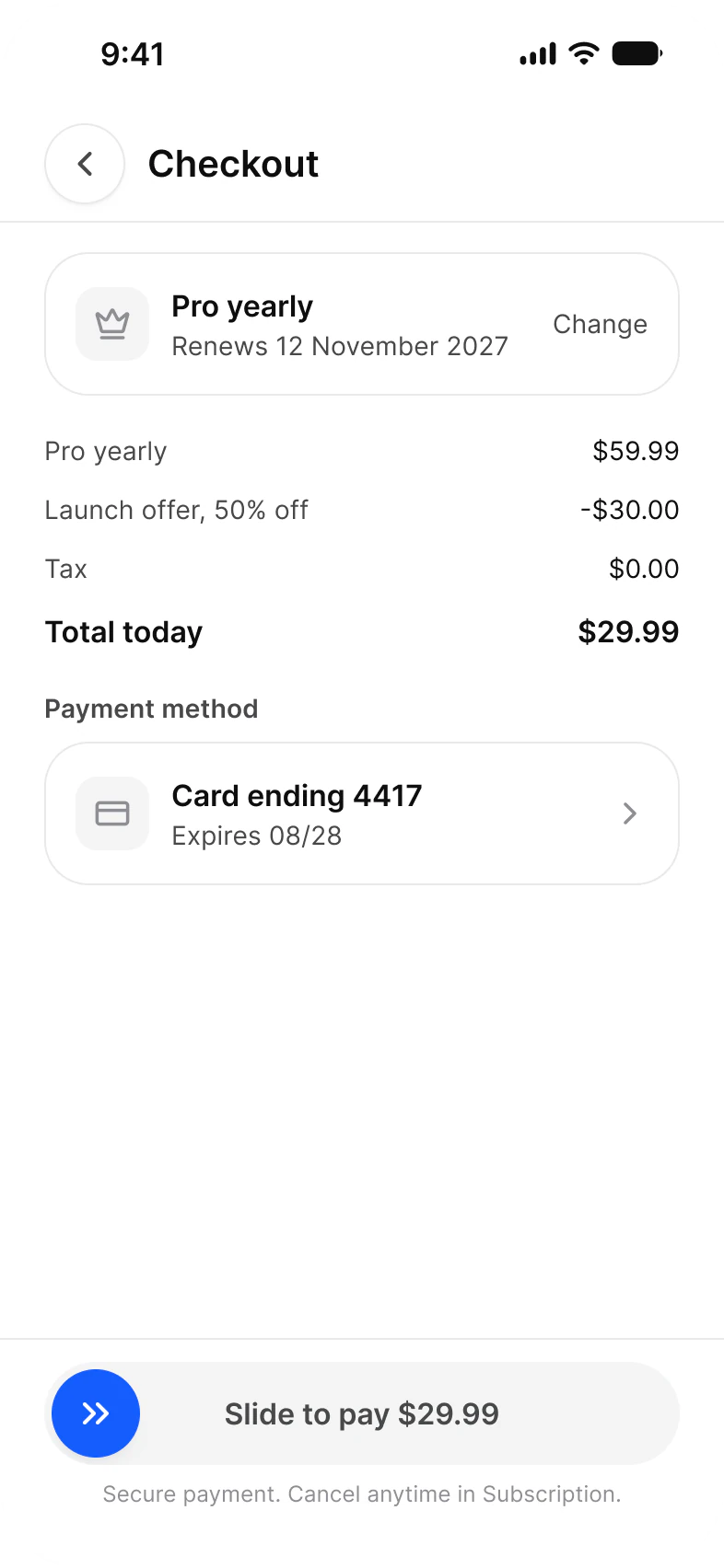
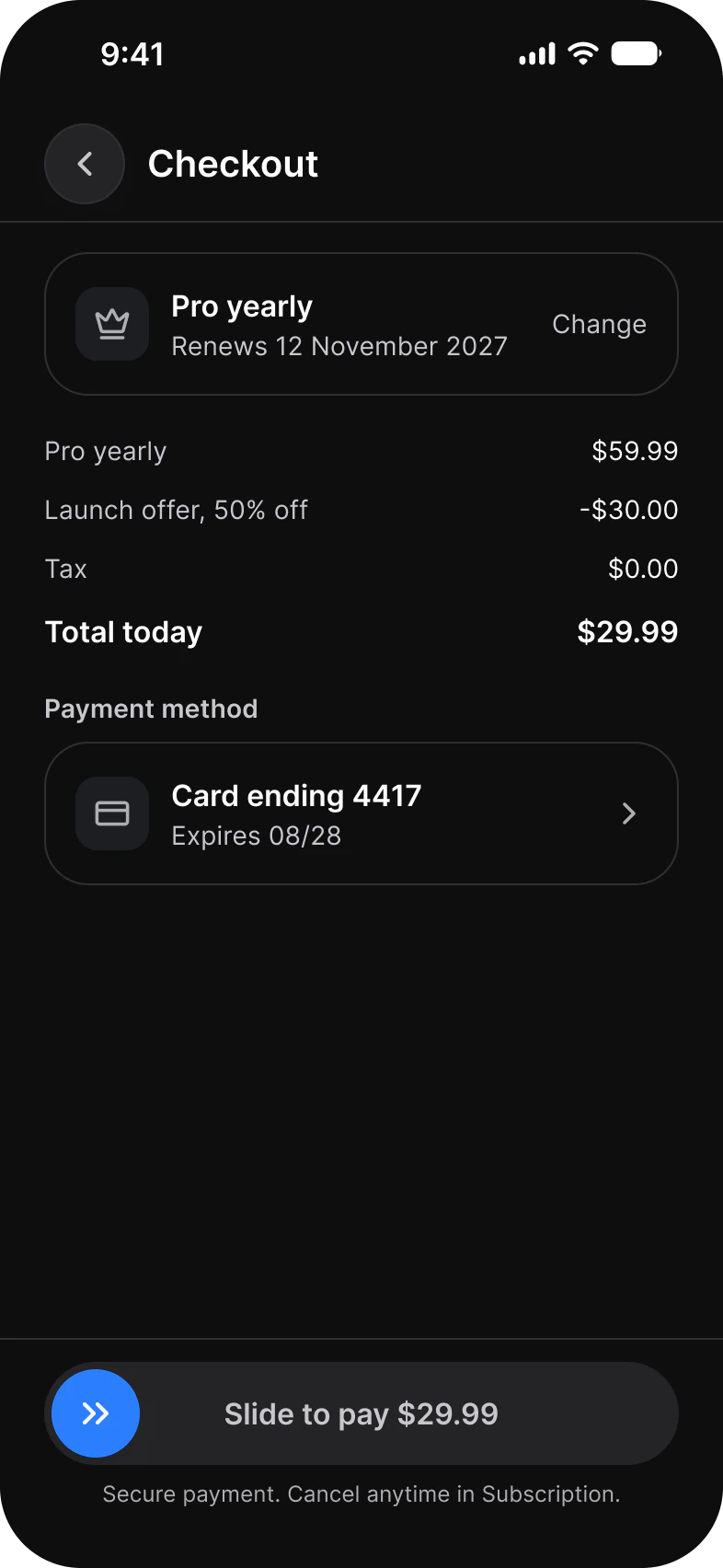
In code, complete at 85% of the track and snap the thumb back below it. Give assistive tech a plain button with the same label, because VoiceOver and TalkBack users cannot be asked to drag.
Properties
Two variant axes and three content properties.
| Property | Type | Default |
|---|---|---|
Type | Brand, Error | Brand |
State | Default, Sliding, Complete, Disabled | Default |
Label | Text | Slide to finish |
Complete Label | Text | Finished |
Icon | Instance swap | Chevrons right |
| Set | Variants | Size |
|---|---|---|
Slide Button | 8, Type crossed with State | 345 x 56 |
Dimensions
A 56 track holds a 48 thumb, 4 in from every edge.
| Part | Value |
|---|---|
| Track | 345 x 56, fully round |
| Thumb | 48, fully round |
| Inset | 4 on every side of the thumb |
| Complete point | 85% of the track, in code |
Does Slide Button have a native iOS or Android control?
No. Neither platform ships a slide to confirm control, so Slide Button is built as a custom view on both.
| Platform | Counterpart | What to build |
|---|---|---|
| iOS | None. SwiftUI and UIKit have no slide to confirm control. | A custom view with a drag gesture on the thumb, and an accessibility action that confirms in one step. |
| Android | None. Material 3 has no slide to confirm control. | A custom composable with a horizontal drag, and a semantics action that confirms in one step. |
Prototype
Drag the thumb to reach Complete in 320 ms on motion/easing/emphasized. Tap Complete to reset.
The prototype runs on the kit's Motion tokens, so the timing in Figma is the timing to build.
See Slide Button in the kit.
The read-only Figma preview opens the Appetite UI file on Slide Button, so you can check it before you buy.
The file holds 592 variables in 6 collections and exports its token values to SwiftUI, Jetpack Compose, Flutter and CSS. Solo covers one person and Team up to ten people. You pay once and keep lifetime updates.