Updated
Calendar
A calendar app UI kit for Figma, drawn as eleven screens in light and dark: one week of events shown as a month, a week, a day and an agenda, and the screens that open, add, invite and resolve an event. Every control is an instance of an Appetite UI component, so one token change moves every screen.
Updated
Preview
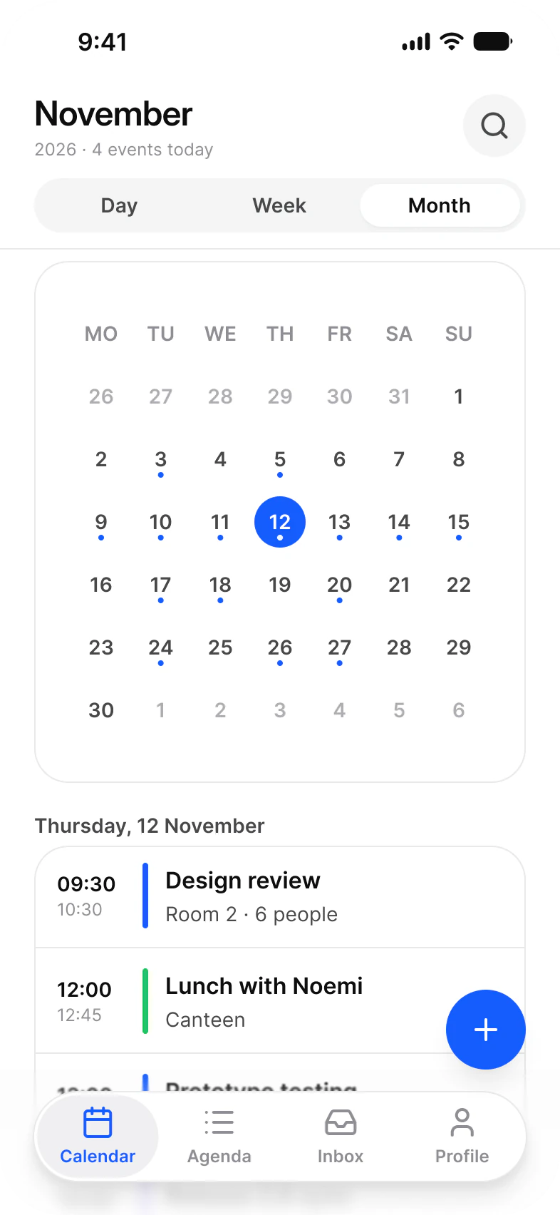
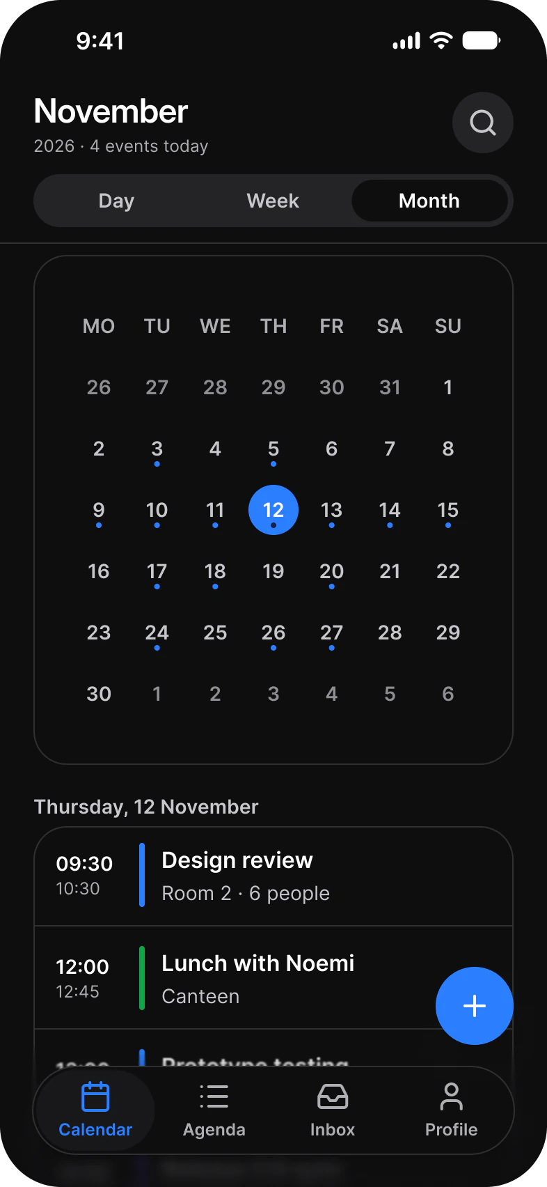
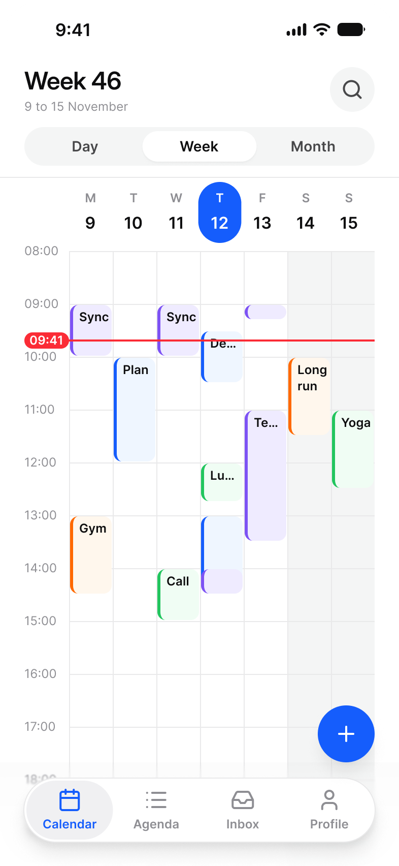
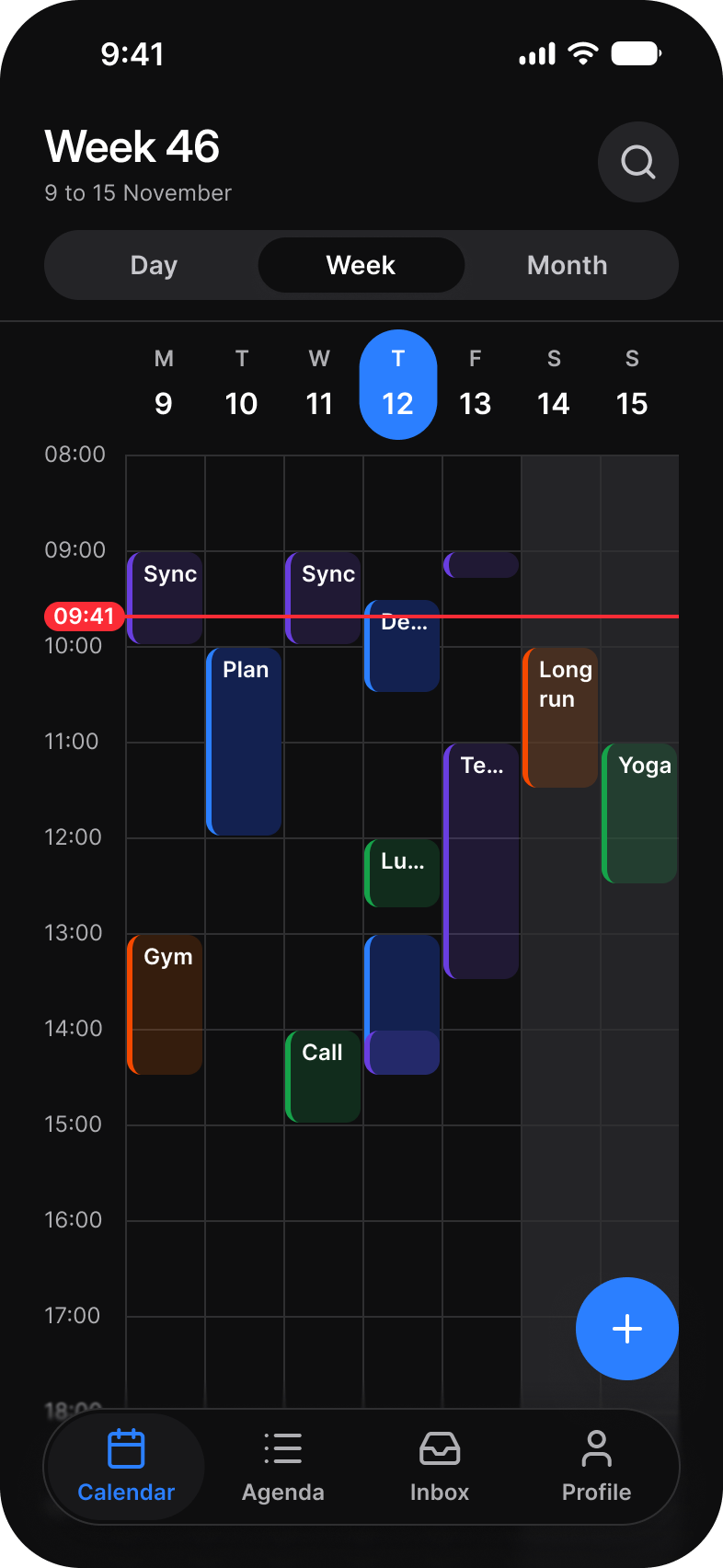
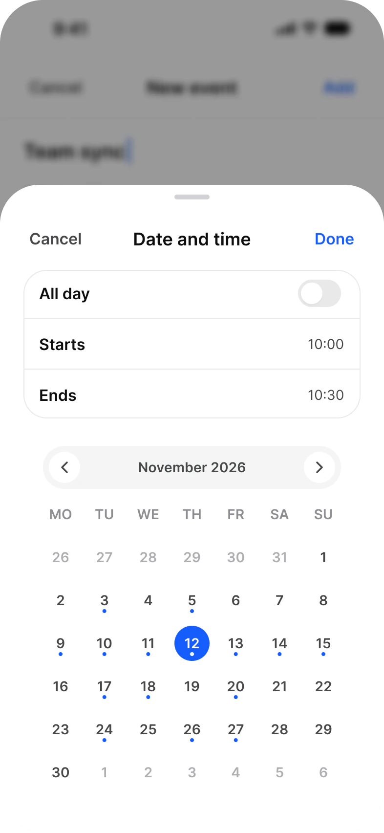
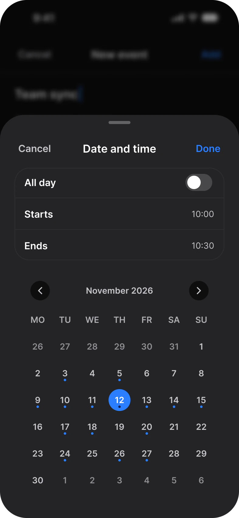
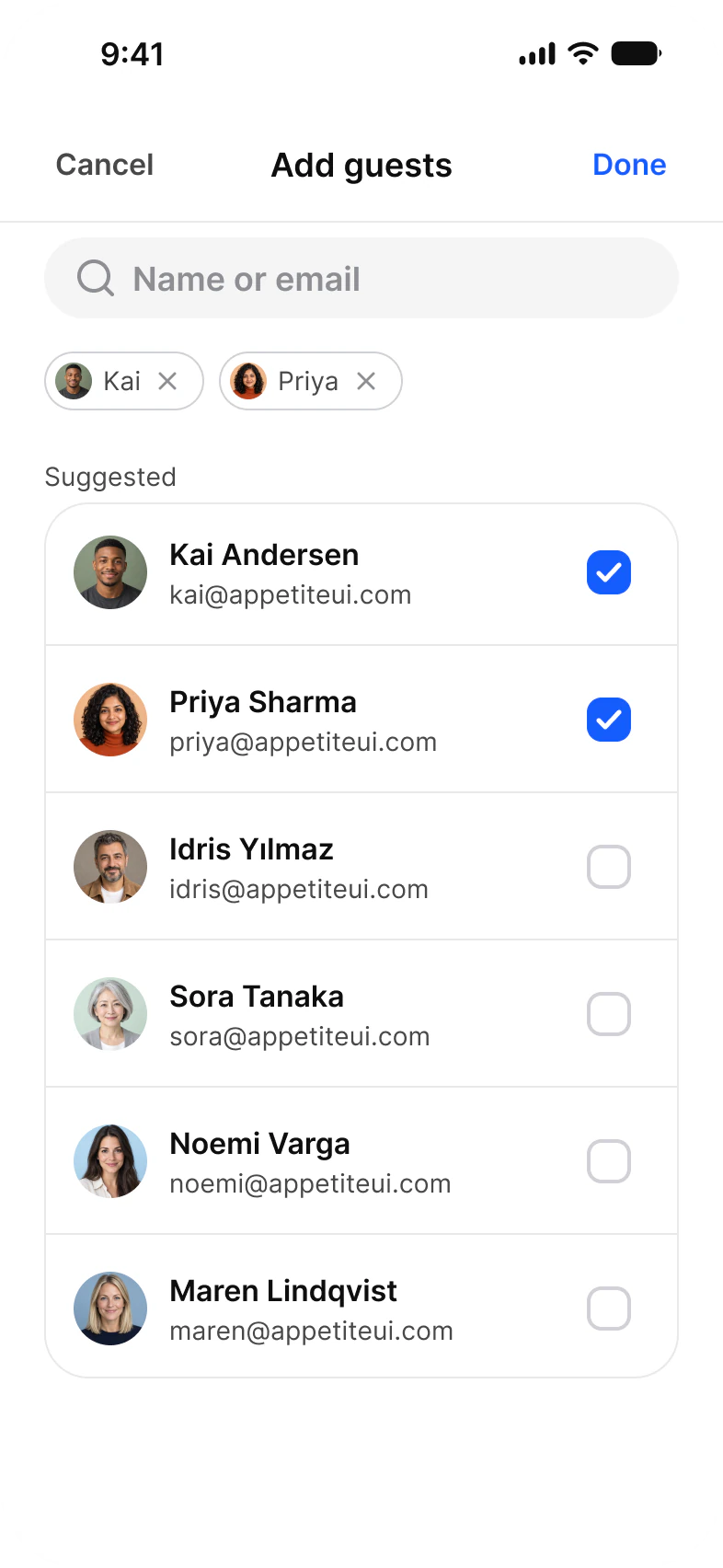
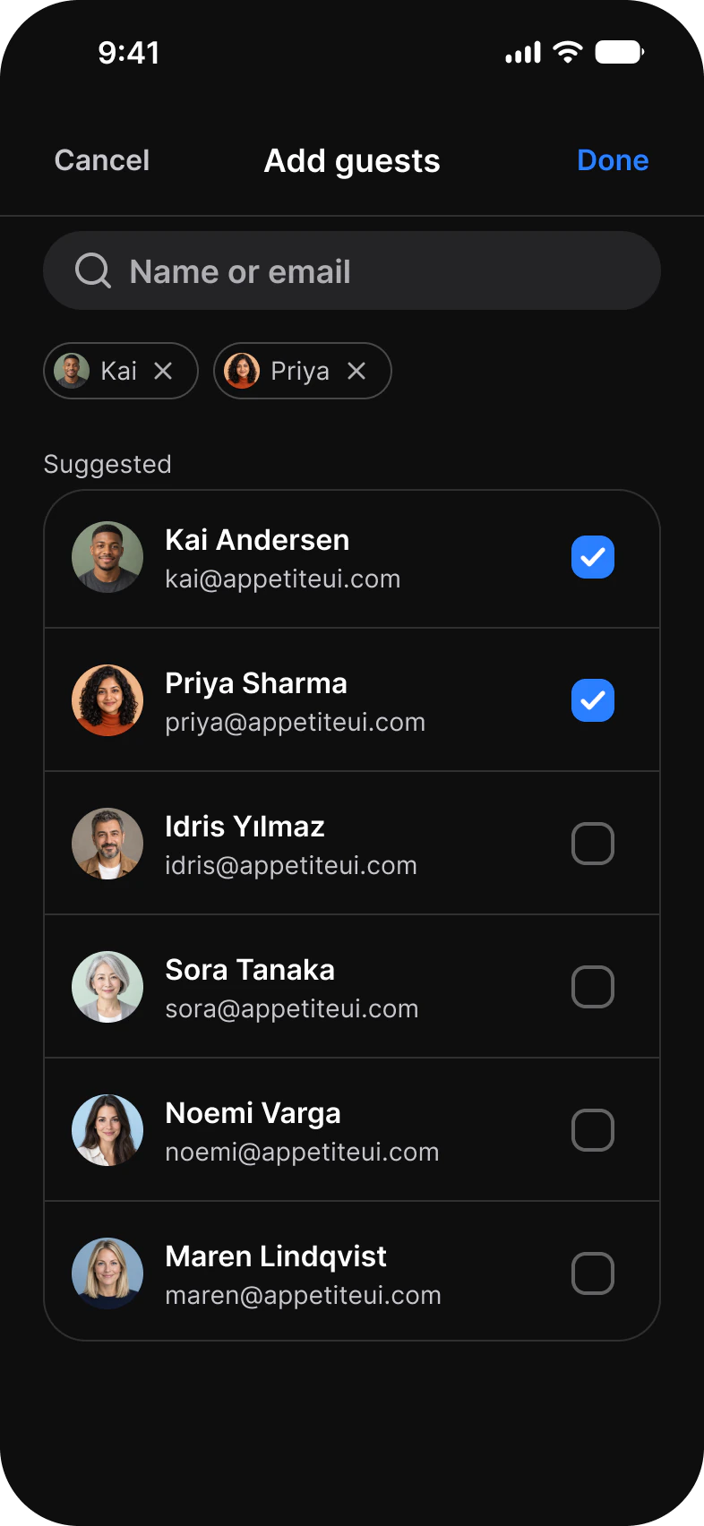
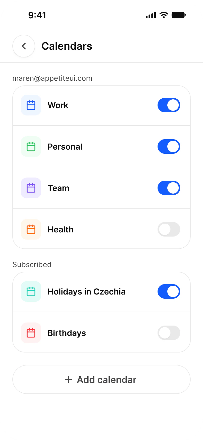
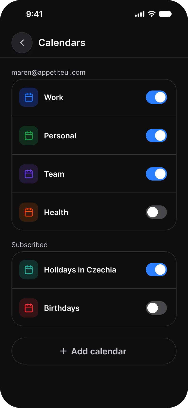
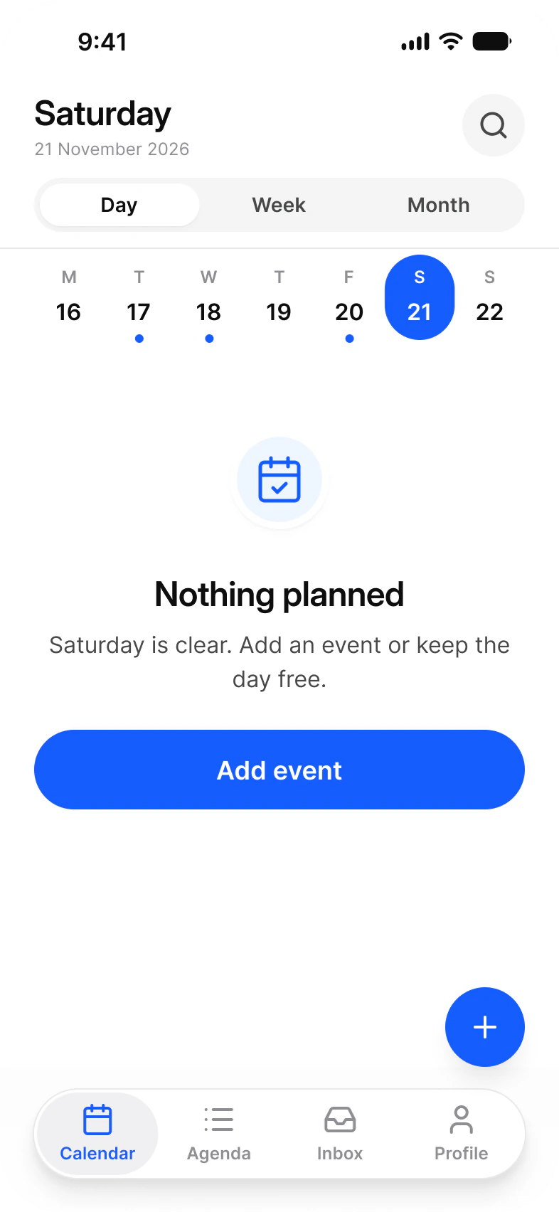
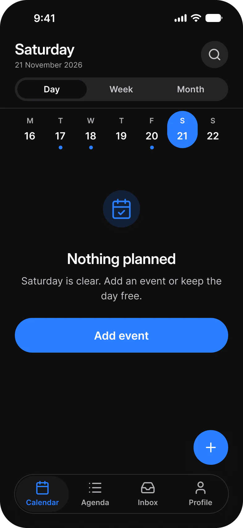
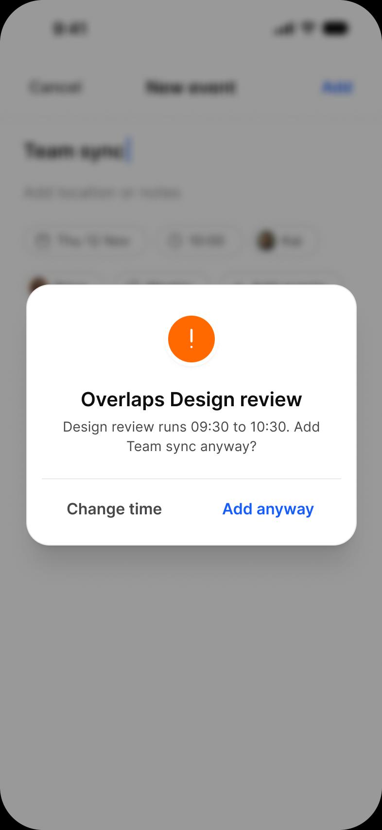
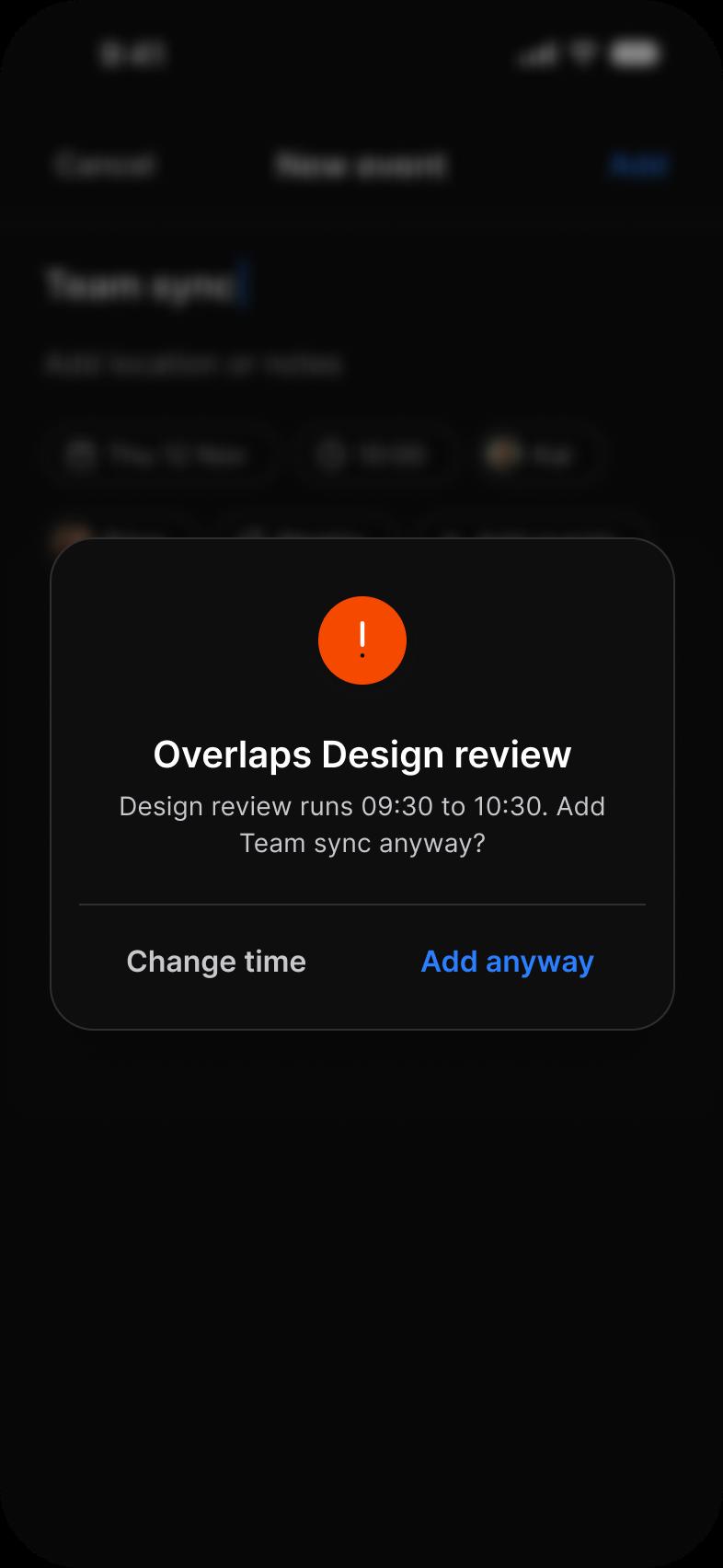
Eleven screens for one calendar app. Month, Week, Day and Agenda show the same events four ways, Event opens one, New event, Date and time and Add guests create one, and Calendars, Empty day and Conflict cover the rest. Each screen is drawn in Light and in Dark.
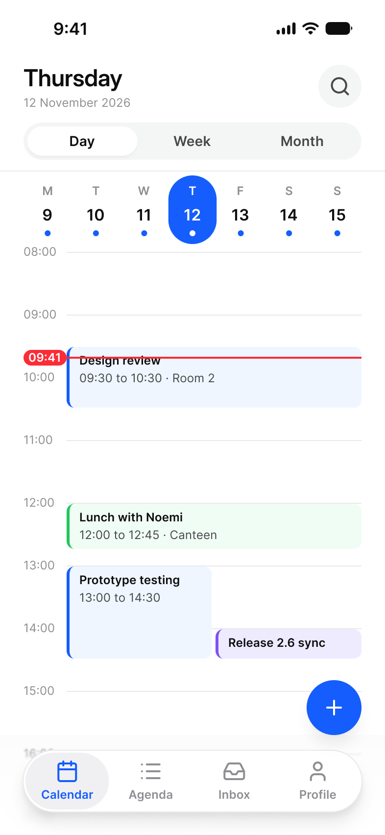
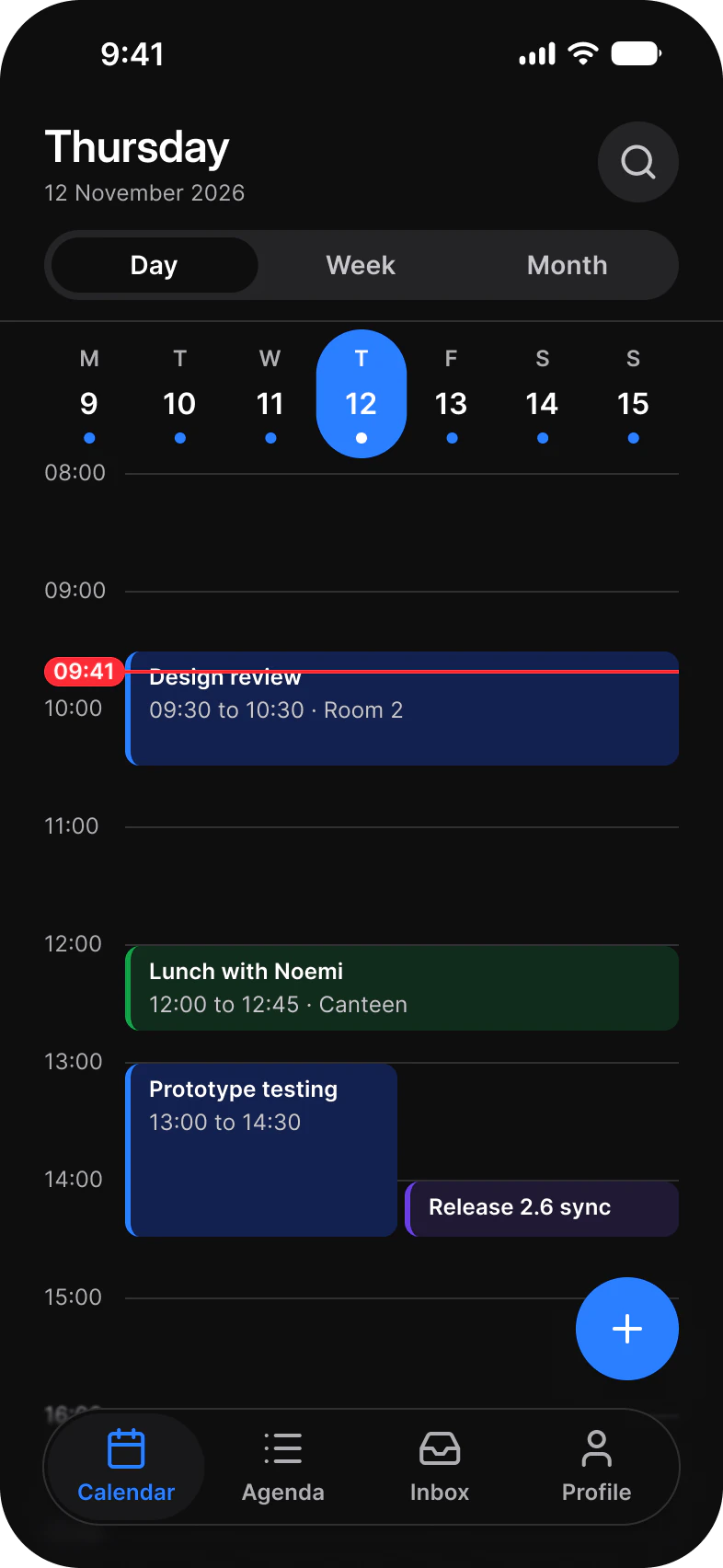
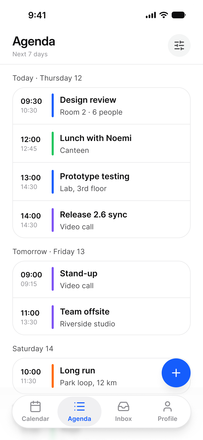
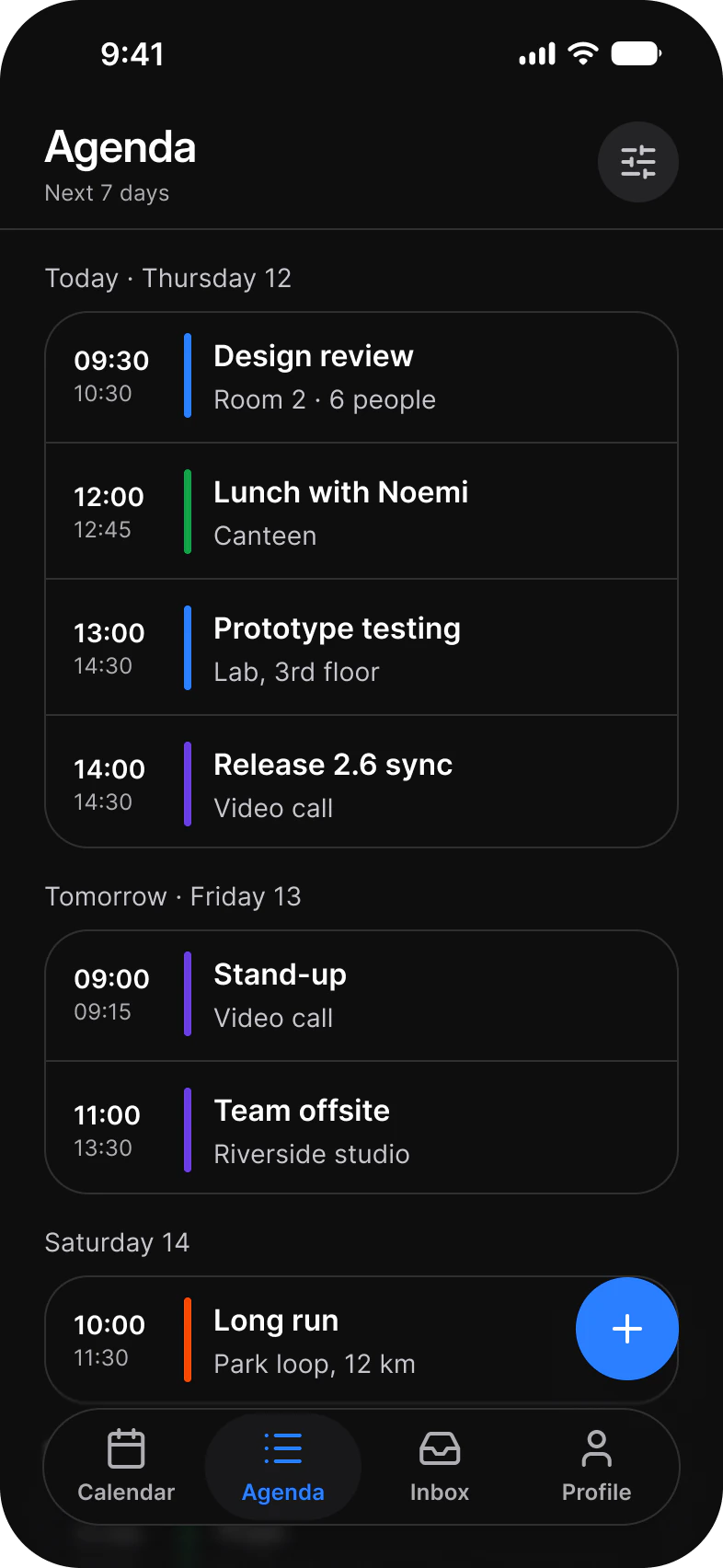
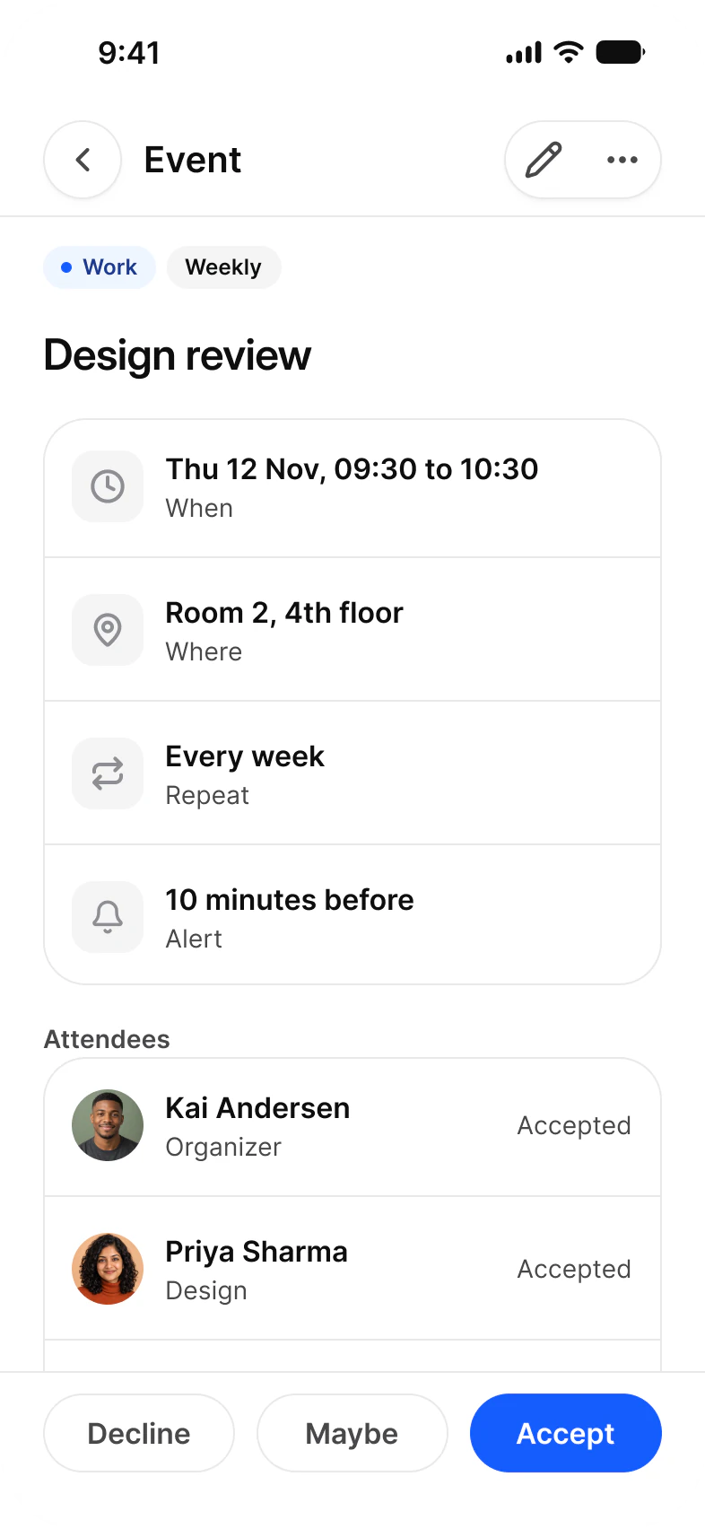
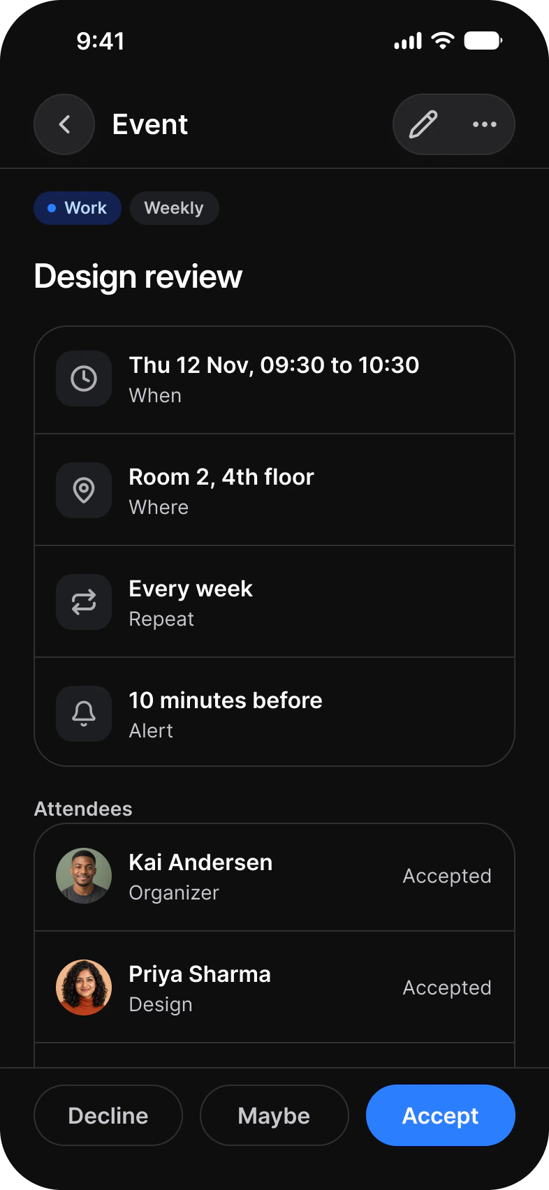
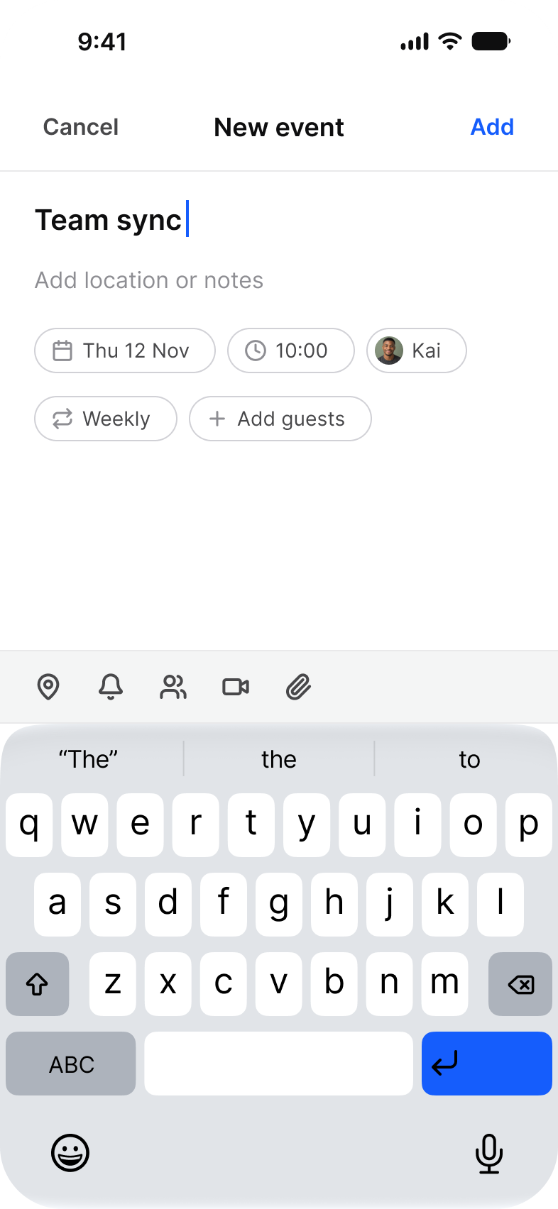
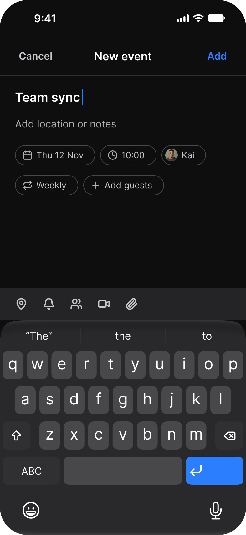
| Screen | What it shows | Built from |
|---|---|---|
| Month | A month grid with event dots and the selected day's events under it | Date Picker, Calendar Event, Segmented Control, Floating Action Button, Navigation |
| Week | Seven day columns on an hour grid with a now line | Week Strip, Time Grid, Calendar Event, Now Indicator, Segmented Control |
| Day | One day on the same hour grid | Week Strip, Time Grid, Calendar Event, Now Indicator, Segmented Control |
| Agenda | The next seven days as a list grouped by day | Calendar Event, Divider, Navigation |
| Event | One event: time, place, repeat, alert, attendees and a reply | Top Bars, Badge, List, Divider, Button |
| New event | A title, property chips and the keyboard | Top Bars, Chip, Keyboard |
| Date and time | A sheet with an All day switch, start and end rows and a date picker | Top Bars, List, Chip, Date Picker |
| Add guests | Search, picked guests as chips and a suggested list to tick | Search, Chip, List, Checkbox |
| Calendars | Calendars to show or hide, own and subscribed | Top Bars, List, Button |
| Empty day | A day with nothing planned and one action | Week Strip, Empty State, Button |
| Conflict | An alert over New event when two events overlap | Alert, Top Bars, Chip |
What does a calendar flow need from a component library?
One event drawn at four densities, a time grid that knows the hour, and sheets to create, invite and resolve.
A calendar needs a month grid, a time grid for a week and a day, a way to show where now is, one event block that works at every size, a list for the agenda and the event details, and sheets for picking a date, adding guests and warning about a clash. In this set the month grid is the Date Picker, the event is one Calendar Event component in four places, and New event, Date and time, Add guests and Conflict are the screens around it.
| Need | Component | Where it appears |
|---|---|---|
| Switch between Day, Week and Month | Segmented Control | Month, Week, Day, Empty day |
| Show a month at a glance | Date Picker | Month, Date and time |
| Lay a day out by the hour | Week Strip, Time Grid, Now Indicator | Week, Day |
| Draw one event at any size | Calendar Event | Month, Week, Day, Agenda |
| Read the details of one event | List, Badge, Divider | Event |
| Answer an invitation | Button | Event |
| Write a new event | Chip, Keyboard | New event |
| Invite people | Search, Chip, Checkbox, List | Add guests |
| Say a day is empty | Empty State, Button | Empty day |
| Warn about a clash | Alert | Conflict |
| Move around the app | Navigation, Top Bars | Five screens carry the tab bar, the rest a top bar |
How do Month, Week, Day and Agenda share one set of events?
The four views read the same week. Only the density of Calendar Event changes, from a dot in the month grid to a block on the time grid and a row in the agenda.
Month, Week and Day share one header: a title with the date under it, a search button and a Day, Week and Month switch. Week and Day add the Week Strip under it and lay events on the Time Grid, where the Now Indicator draws the red line at 09:41. Agenda drops the grid and lists the same events by day, start and end time on the left and a colored bar for the calendar each one belongs to.
| View | Screen | Built from |
|---|---|---|
| Month | Month | Date Picker 1, Calendar Event 4 for the selected day, Divider 3 |
| Week | Week | Week Strip 1, Time Grid 1, Calendar Event 13, Now Indicator 1 |
| Day | Day | Week Strip 1, Time Grid 1, Calendar Event 4, Now Indicator 1 |
| Agenda | Agenda | Calendar Event 8, Divider 4 |
The color of an event follows its calendar: Work, Personal, Team and Health on the Calendars screen are the same four colors the blocks wear on Week and the bars on Agenda.
What are the Calendar screens built from?
Every instance placed directly on the light frames, counted by the component it comes from. The dark row holds the same instances.
The light row holds 166 placed instances and 326 more nested inside them. A component is counted by its set name, so every Button variant is a Button, and an icon is any instance named in lowercase.
| Component | Placed | Where |
|---|---|---|
| Calendar Event | 29 | Month 4, Week 13, Day 4, Agenda 8 |
| Divider | 24 | Month 3, Agenda 4, Event 6, Date and time 2, Add guests 5, Calendars 4 |
| List | 23 | Event 8, Date and time 3, Add guests 6, Calendars 6 |
| Chip | 18 | New event 5, Date and time 5, Add guests 2, Conflict 6 |
| Status Bar | 11 | Every screen |
| Button | 9 | Event 3, one each on Month, Week, Day, Agenda, Calendars and Empty day |
| Top Bars | 7 | Event, New event, Date and time 2, Add guests, Calendars, Conflict |
| Checkbox | 6 | Add guests |
| Scroll Edge | 5 | Month, Week, Day, Agenda, Empty day |
| Navigation | 5 | Month, Week, Day, Agenda, Empty day |
| Floating Action Button | 5 | Month, Week, Day, Agenda, Empty day |
| Lucide icons | 5 | The New event toolbar |
| Segmented Control | 4 | Month, Week, Day, Empty day |
| Week Strip | 3 | Week, Day, Empty day |
| Date Picker | 2 | Month, Date and time |
| Time Grid | 2 | Week, Day |
| Now Indicator | 2 | Week, Day |
| Badge | 2 | Event |
| Keyboard | 1 | New event |
| Search | 1 | Add guests |
| Empty State | 1 | Empty day |
| Alert | 1 | Conflict |
Counted on November 18, 2026 with a read-only Plugin API script over the light frames of the Calendar page in the Appetite UI 2.6 Figma file. Placed counts an instance that is not inside another instance. Hidden layers count.
Start from these screens.
Every frame on this page is part of the Appetite UI file, drawn from its components and bound to its variables, so one brand edit moves every screen in light and dark.
The file holds 592 variables in 6 collections and exports its token values to SwiftUI, Jetpack Compose, Flutter and CSS. Solo covers one person and Team up to ten people. You pay once and keep lifetime updates.
The read-only Figma preview opens the whole file, every screen and every variable, before you buy.